

The Collapse of Color in the Modern World
And What to Do About It...

It’s no secret that the world is losing its color. Everywhere we go, we are surrounded by grey and beige neutrality. It is almost impossible to find an area of life untouched by the collapse of color. Why is this happening? What does it say about our society? Most importantly, what do we do about it?
The Evidence
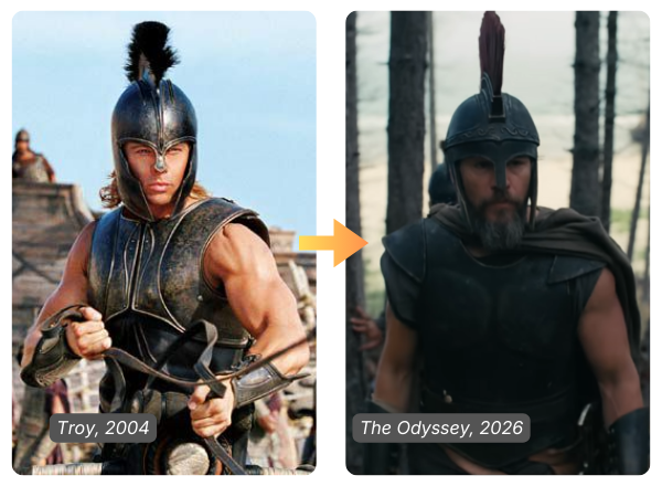
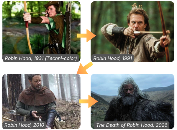
Movies have become darker and more colorless with each passing year. Look at the progression of Robin Hood adaptations. The tonal shift toward grey realism is abundantly obvious.
But this isn’t happening just in cinema. It’s happening everywhere.
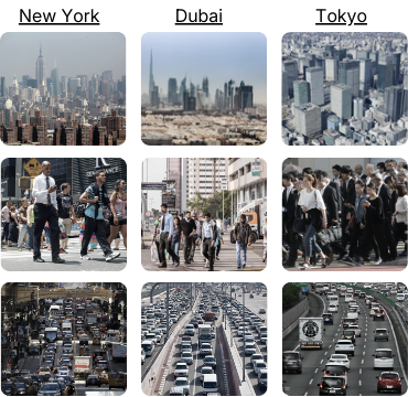
A study by All Star Home researched the most popular paint colors by state according to Google search data over a 12-month period.
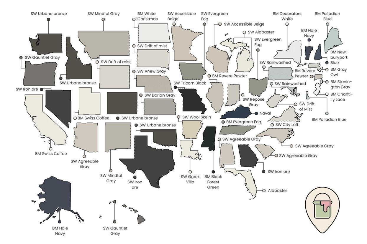
The most popular colors were all bland neutral shades.
Fashion. Design. Architecture. Each one has followed the same pattern; a rejection of the colorful, in favor of the neutral.
What is the reason for this?

The Origin of Chromophobia
In his book Chromophobia, David Batchelor argues that the western disdain of color goes all the way back to Ancient Greek philosophy. Aristotle believed that linework and geometry were the true mediums of meaning, and that color was at best secondary and at worst a mere sensory distraction.
“A random distribution of the most attractive colours would never yield as much pleasure as a definite image without colour.” -Aristotle
Because of this, a recurring suspicion of color appears in parts of Western thought- a tendency to treat it as emotional and excessive. This suspicion intensified in the late 19th century, with the rise of industrialization and post-modernism.
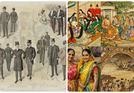
The East, less shaped by Aristotelian influence, and late to industrialization, was more resistant to abandoning its deep affection for color.
The Sterilization of the World
But as globalization has increased, so too has cultural homogeneity, and the same forces that pushed color from the West have now threatened the East as well. The result is a bland uniformity, a sterile likeness, and an erasure of distinction.
Everywhere now looks the same. This phenomenon is often referred to as “cultural homogenization”.
In a 1909 article addressing Indian nationalism, British author G.K. Chesterton warned against the danger of cultural homogenization. He claimed that each people had a right to express their own distinct culture, and he urged Indian nationalists not to conform their traditions to that of secular British Imperialists.
The article inspired Mahatma Gandhi so much, that he translated it into Gujarati, stopped wearing a suit & tie, and started wearing traditional Indian clothing.
Chesterton viewed cultural distinction as a good and healthy expression.
God, the Greatest Wielder of Color
Although Chesterton did not flush out a full theory of color, he explicitly believed color was a purposeful creation of God.
“The sky is blue not because it must be, but because it was chosen that way.” -G.K. Chesterton
Chesterton believed God to be the master artist. Clearly God did not have an aversion to color. He put it into everything, and every color communicates some meaning to us. Different colors naturally invoke different feelings and emotions. Thus, the color choices of God in His creation present us with a sort of cosmic riddle- what is the artist trying to tell us?
This view of color as something that is coded into creation, as opposed to a mere optical illusion, is supported by science. An object’s color is determined by its molecular structure. Different molecular structures absorb different wavelengths and reflect others. When these wavelengths reach our eyes, our eyes process the wavelengths as RGB values and transmit them to our brain, which then perceives the color.
This fact calls Aristotle’s assumptions into question. It means that color can communicate meaning in the same way that form does, because they are tied together at the most basic level.
It also means that the response to chromatic minimalism might not necessarily be chromatic maximalism, but rather the proper usage of color unto form- tasteful color.
Color Perfected
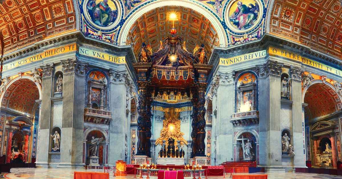
A good example of this is St. Peter’s Basilica in Rome. Each color was precisely chosen by master Renaissance artists to communicate and reflect transcendent meaning. The rich gold throughout the nave and the dome reflects light and emphasizes sacred significance.
The deep blue backgrounds of the dome mosaics were meant to induce the same feeling of looking up at the sky and into the heavens. Blue is a soothing color, but when paired with gold it becomes royal and transcendent.
The red vestments and decorative inlays represent Christs blood, martyrdom, and ecclesiastical authority. It is a visually striking accent that helps contrast and complete the range of colors in the basilica.
All of this combined results in a sensory experience that is not minimalist and meaningless, nor is it chaotic and overstimulating...
... it is ordered and deeply meaningful.
Color and Re-Enchantment
If color is meaningful, is it any wonder that its collapse has coincided with the collapse of faith in meaning itself?
Of all the forces driving chromophobia, perhaps the un-enchantment of the world is the strongest. Perhaps a cultural restoration of faith and meaning would bring along an aesthetic renewal- one that does not see color as the enemy, but as a beautiful tool given to us by our Creator.